Yokō
/Branding
/Packaging
/Illustration
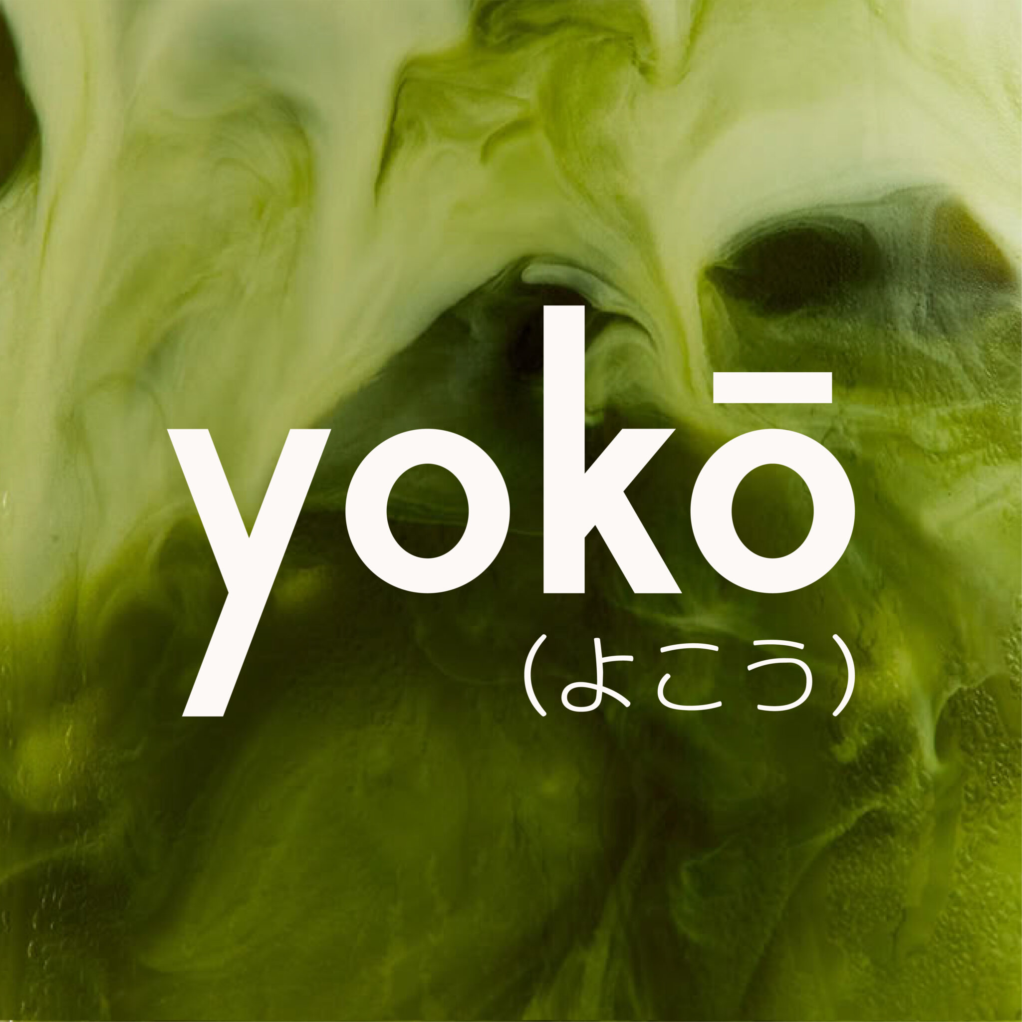
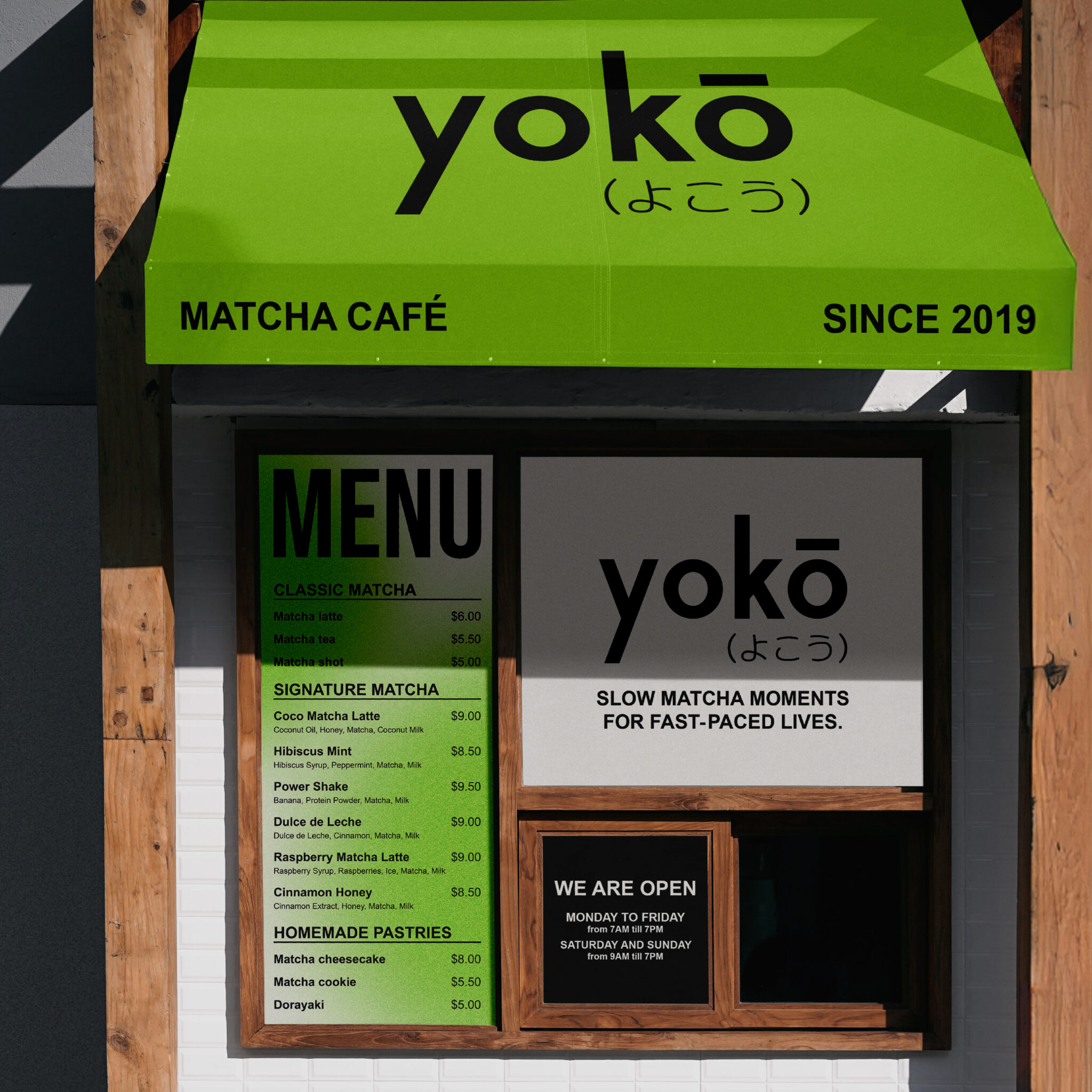
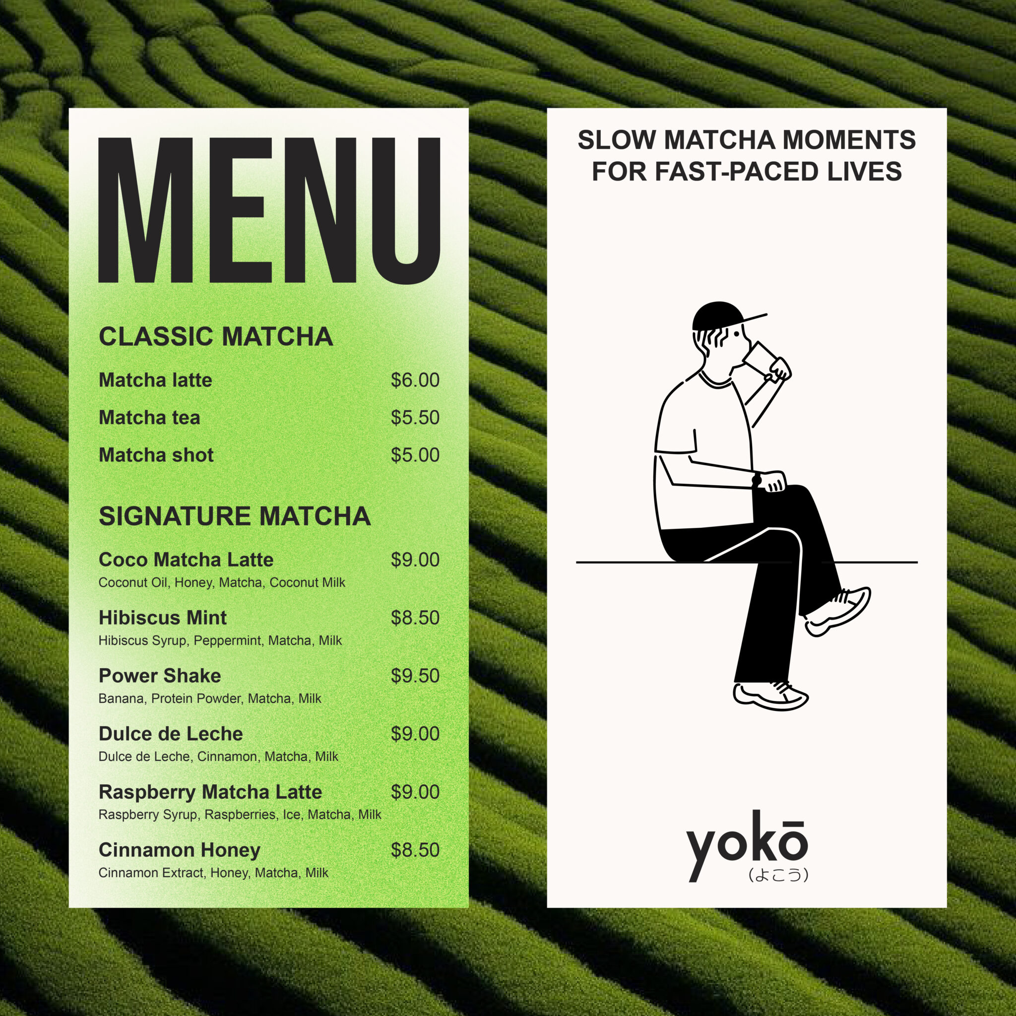
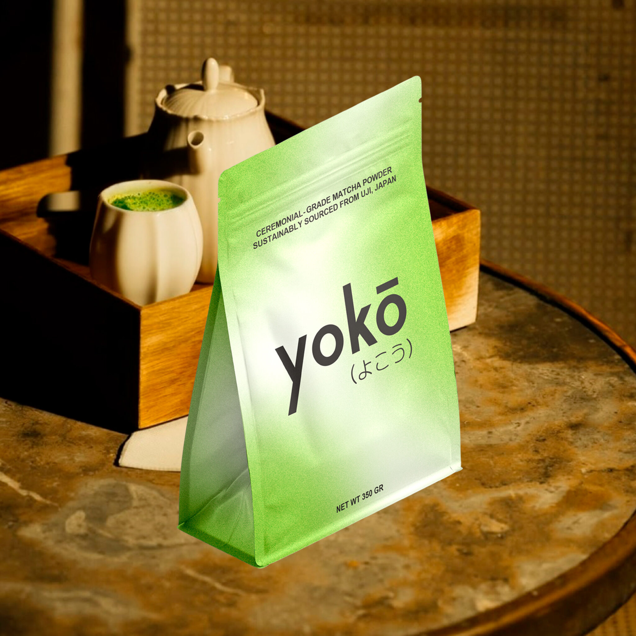
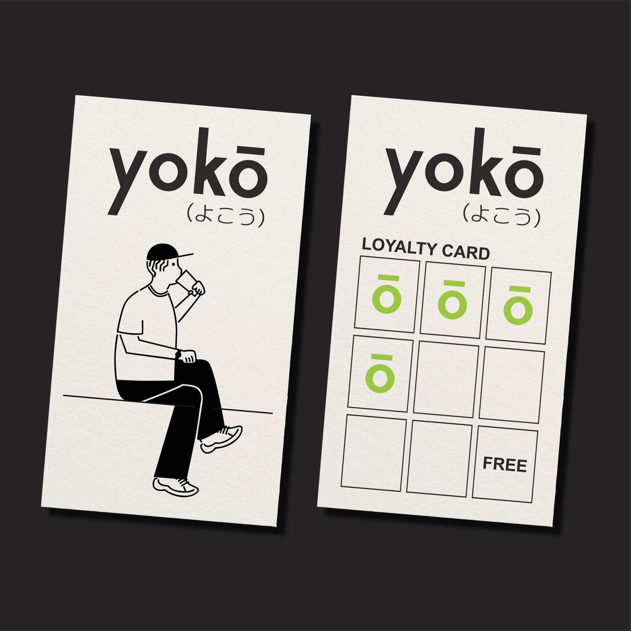
Yokō is a Japanese matcha bar inspired by Tokyo’s quiet side streets and fast-paced city life. This branding project explores the contrast at the heart of Yokō, a calm space within the city’s chaos. The identity honors the cultural roots of matcha while reflecting its authenticity and premium quality.
Contrast
Cultural connection
Yokō is a brand of contrasts. This duality is expressed through the elongated stems of the “y” and the “k”, representing both stillness and motion, elevation and grounding.
よこう marks the correct Japanese pronunciation of Yokō. While honoring its cultural roots, it also brings visual balance to the logo.
Contrast
Yokō is a brand of contrasts. This duality is expressed through the elongated stems of the “y” and the “k”, representing both stillness and motion, elevation and grounding.
Cultural connection
よこう marks the correct Japanese pronunciation of Yokō. While honoring its cultural roots, it also brings visual balance to the logo.